Cherry-Picking Facts about Crime
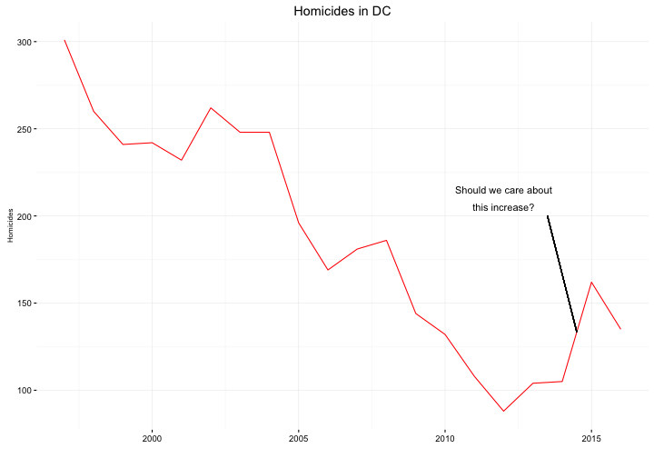
The White House website says that homicides in DC increased by 50% in 2015. This is technically correct (they increased from 105 in 2014 to 162 in 2015), but it also represents the worst of cherry picking data to defend an already determined position (or in this case, an “alternative fact”) rather than using data to draw conclusions. It forgets to mention that homicides dropped by 17% (to 135) in 2016 and that they have, overall, trended downward since the 1990s.
The DC police publish homicide counts from 1997 to the present, and I used that to provide historical perspective:

So, should we care about that increase in 2015? We should care in the sense that one homicide is one too many, and it’s possible that it will be indicative of a larger upward trend, but I do not think there is much evidence of that. Instead, the graph pretty clearly demonstrates that the White House cherry-picked the stat to try to paint a picture of rapidly increasingly crime rates and unsafe cities, when the general trend has been positive for the past two decades, not just in DC but elsewhere as well. Politicians have used rising crime rates as an excuse to lock black people up in the past, and I would not be surprised if that is the objective again.
© 2025 Jen Haskell ― Textlog theme by Heiswayi Nrird